SurveyCake chart report provides a clear analysis of survey data. If further data analysis is required, Cross Tabulation can be used to create tables of the analysis to understand the relationship between two variables. The two variables are taken from two questions in a survey. Supported question types include Multiple Choice, Checkboxes, Selection Based, Rating, Single Choice Matrix, Checkbox Matrix and Ranking.
Take the Events Satisfaction Survey as an example. This survey asked about the customers' age, how they found out about the event, and their satisfaction level for the event experience. We need to select two questions as the Base variable and Compare variable for Cross Tabulation.
1. Selecting Base variable and Compare variable
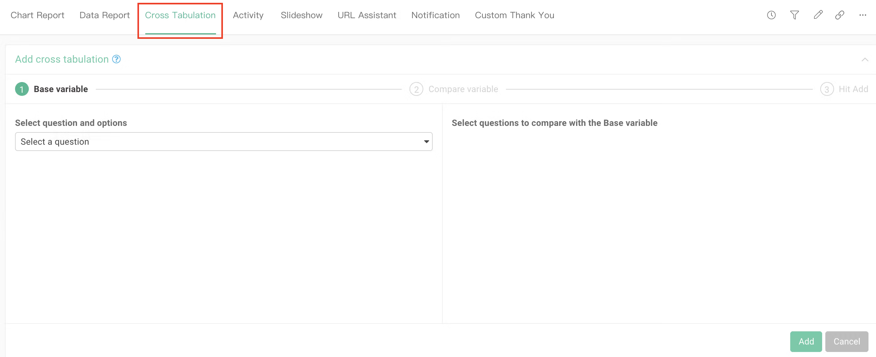
In Cross Tabulation, the question used as the basis is called the Base variable, and the question used to compare against it is called the Compare variable. The first step in Cross Tabulation is to select a Base variable.
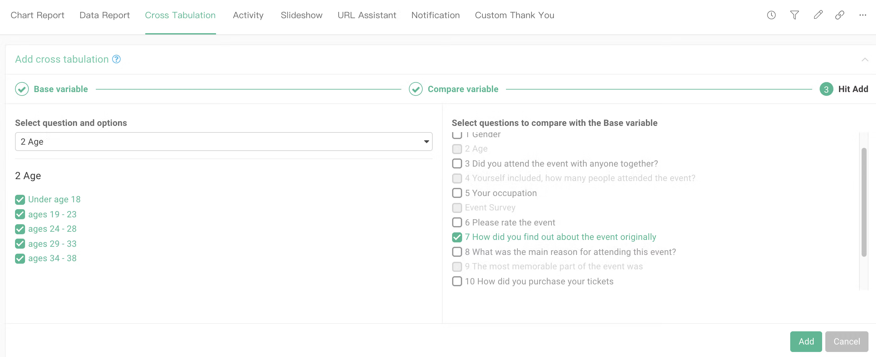
In this example, we select the Multiple Choice "Age" as the Base variable. Then we selected the Checkbox "How did you find out about the event originally?" as the comparison question. In other words, we use the age groups as a basis and compare it to the ratio of how they found out about the event.
In addition, you can further select the options you want to use as the basis in the Base variable. In this example, we have selected all the age groups.
2. Cross tabulation chart
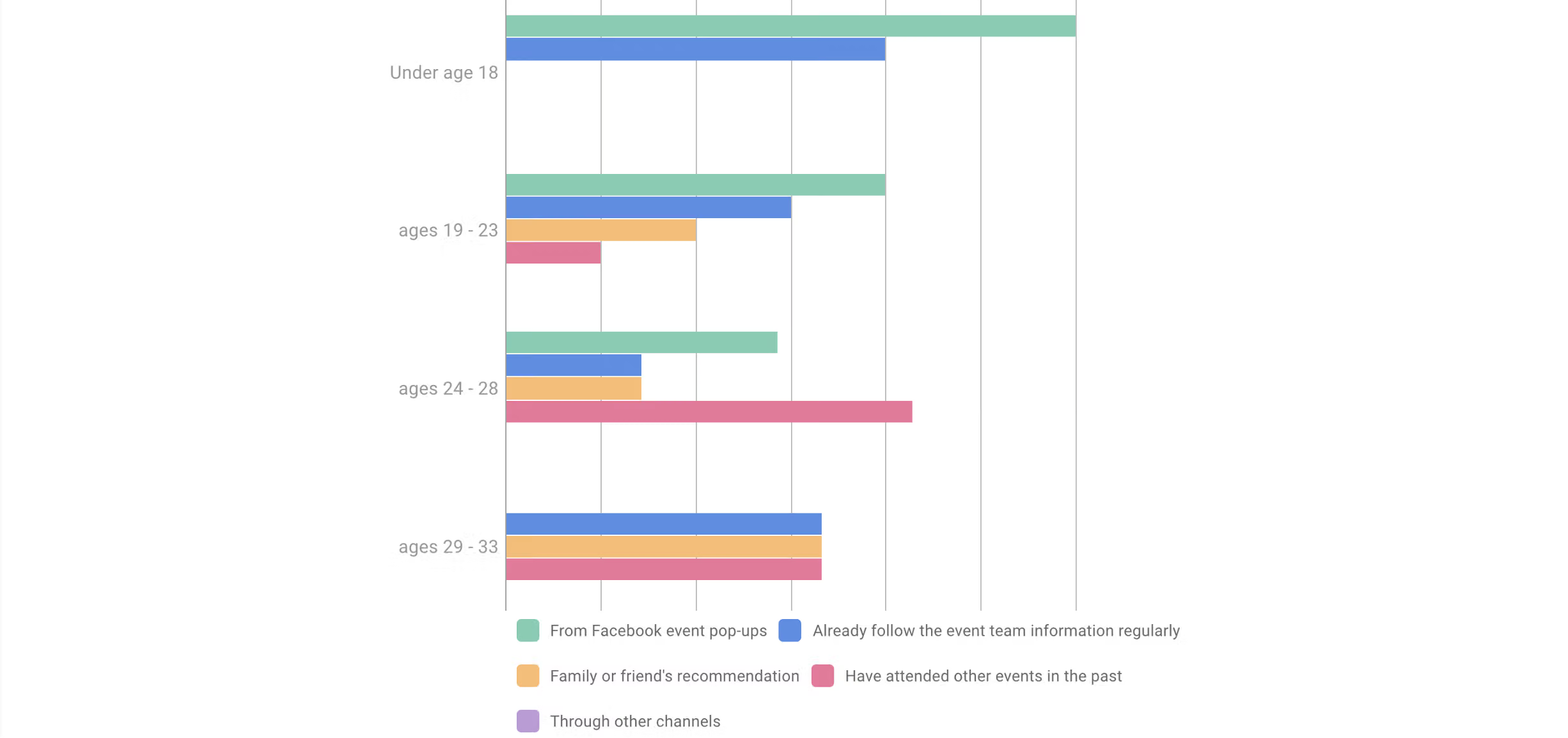
Once the Cross Tabulation has been done, a chart of the results will be generated automatically.
The X-axis unit and display options can be set using the settings bar on the top right corner.
The X-axis unit display can be toggled to Percentage or Absolute.
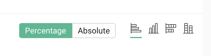
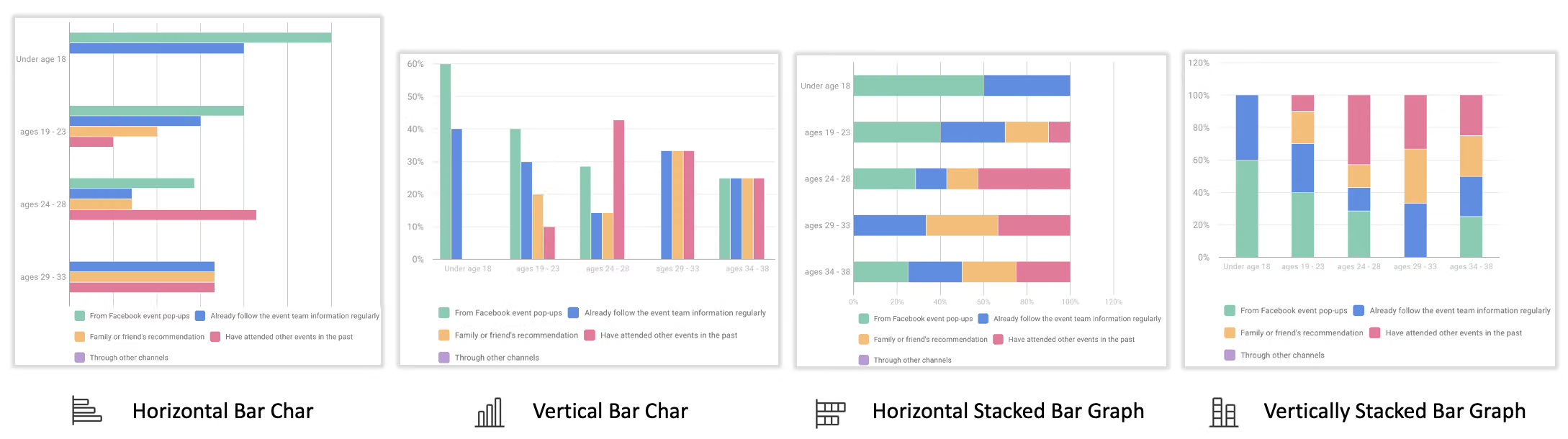
In addition, you can also switch between different displays for the chart itself, including, from left to right, horizontal bar chart, vertical bar chart, horizontally stacked bar graph, and vertically stacked bar graph.
3. Cross tabulation table
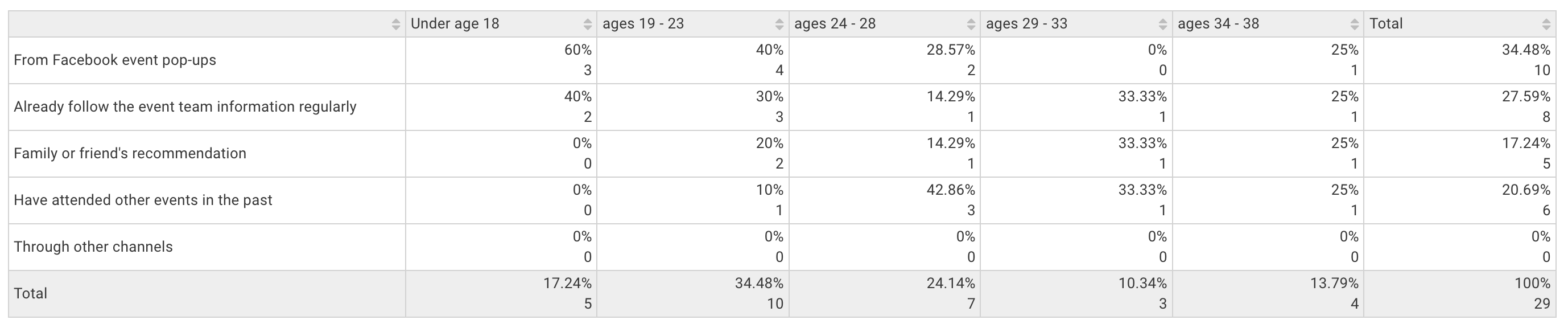
Below the chart is the Cross Tabulation table. You can clearly see the ratio of how different age groups found out about the event.
As shown on the table, 19-24-year-olds make up the largest percentage of the customer base (34.48%), and amongst that group, 40% found out about the event through the Facebook event pop-ups. Hence the main customer base can be strengthened by focusing efforts on the Facebook page.
4. Data export
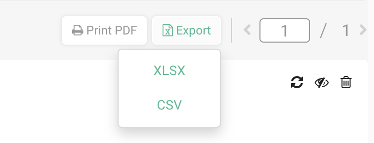
In addition to exporting data, multiple cross-analyses may be added at the same time, and each corresponding analysis chart will be shown below. You can use the button in the upper left corner and select Print PDF or Export (supports XLSX and CSV). With the XLSX format, each Cross Tabulation can be perfectly shown on a separate page!
5. Conclusion
To sum up, let's demonstrate one more Cross Tabulation. This time, using the Single Choice Matrix “Please rate the event” as the Base variable and Multiple Choice "Age" as the Compare variable.
Note! Since the single choice matrix and ranking contain two levels of questions, the additional second-level base variable is required.
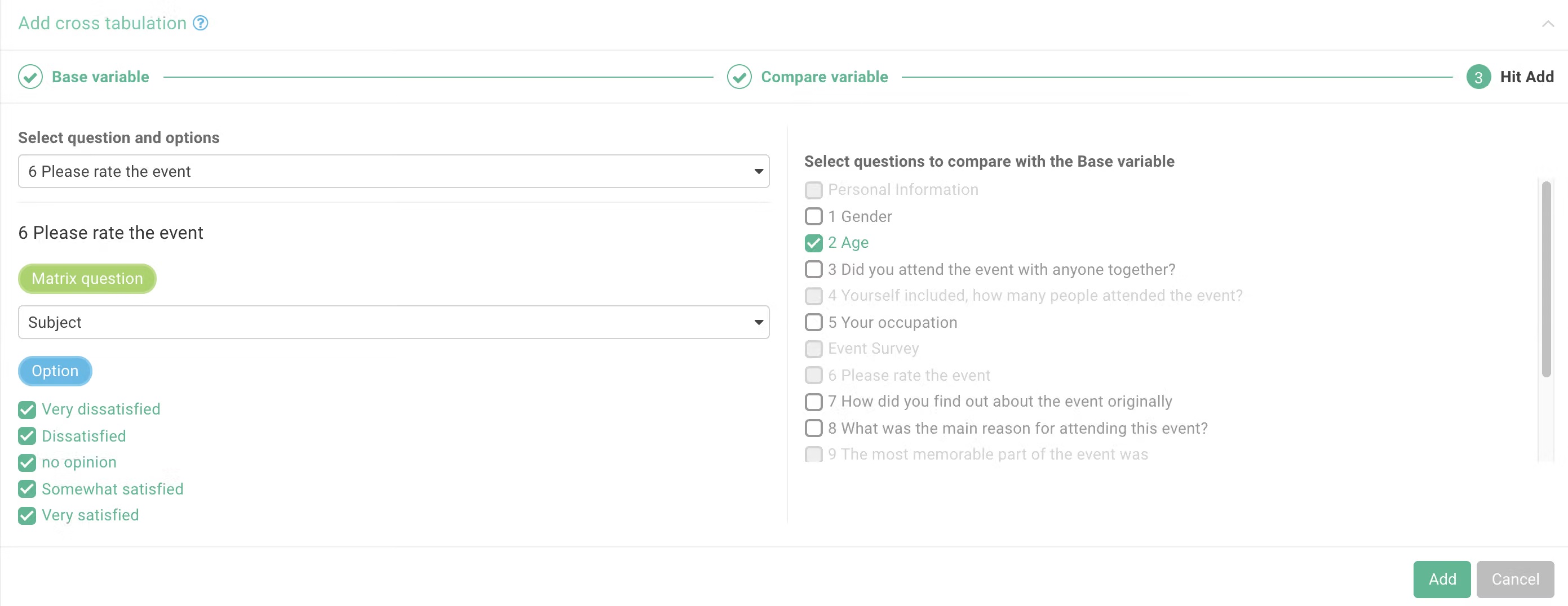
After adding this Cross Tabulation set, the chart for it will automatically be generated!
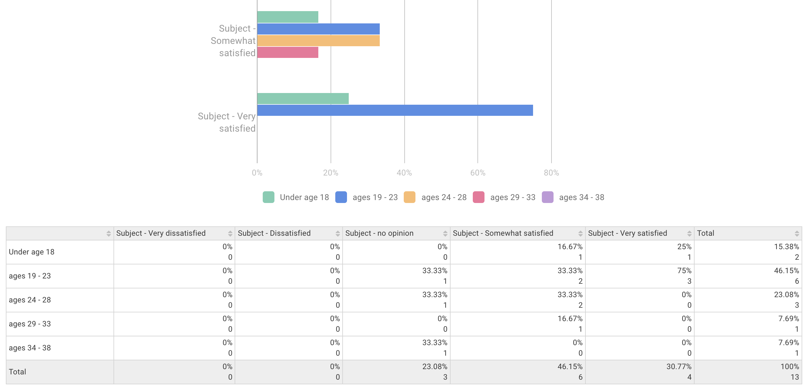
Through Cross Tabulation, it is easy to understand the relationship between multiple variables, and effectively put the data to good use!